Showing posts with label Etailers Don'ts. Show all posts

16 February 2012

Etailers Don't: Out of action

I was at Myer yesterday and I saw the new Autumn/Winter catalogue, and I thought I'd have a look at the Myer website last night.

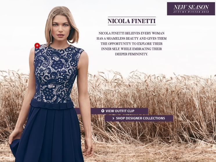
I thought this Nicola Finetti dress is very pretty so I clicked on "Shop Designer Collections".

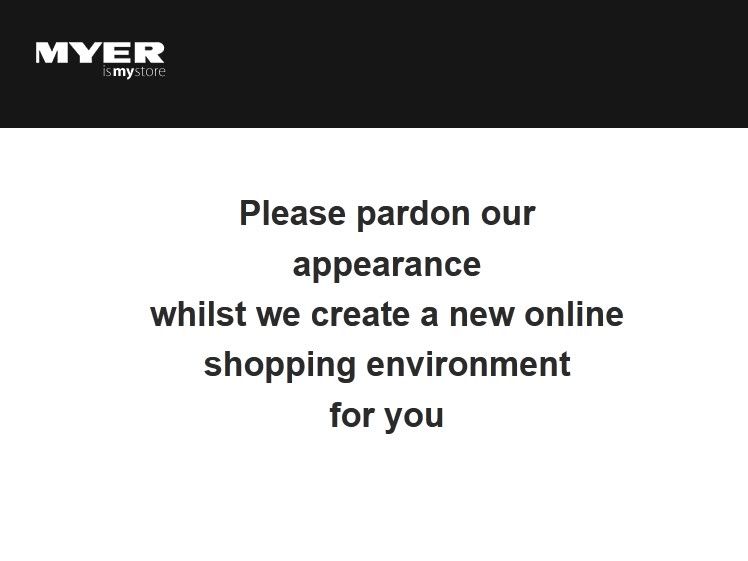
And this came up.

It is bad enough that the e-store is down for maintenance. Myer managed to make it worse by showing such an unprofessional looking message, and there is zero information on when the e-store will be back up again.
You can do better than that Myer. Step up!

P.S. The e-store is back up now but the point remains.

3 February 2012

Etailers Don't: Mystery shipping fees

I wrote about delivery charges in my last post. It is certainly bad if etailers charge exorbitant shipping fees. But it's worse if you don't know.

You would've thought that shipping fees and delivery timeframe are standard information for any online stores. Most e-stores have a "Shipping", "Delivery", "Customer Service" or an "FAQ" link with the relevant information. For some unknown reason, some websites like to keep you guessing.

This website does not give you any information about shipping, in fact there is nothing on customer service at all. It also violates the first and second Etailers Don't rules.

So how do you find out about shipping charges? Maybe by putting something in the shopping cart?

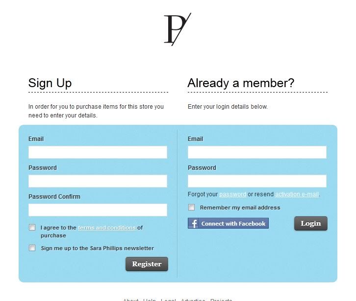
That would be too easy! Instead, you have to register or sign in using your Facebook account. 


Sorry, at this point you've lost the sale.

P.S. An idea for the blog ... are you interested in a directory of ebay auctions from people who read this blog or from my twitter followers? Good for the people selling and good for people looking for a bargain, so it's a win-win, right?

16 January 2012

Etailers Don't: No filter

If I have to name the number one e-store feature lacking in Australian based website, it is the lack of filter. Similar to not offering a "show all items" option, no filter means it take longer for the shopper to get to what they want.

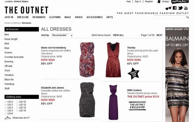
Here's a simple experiment. Let's say I'm going to wedding and I'm in the market for a new dress. I hopped on to The Outnet to see what's available.

I went to the Dress section and there are 2043 different styles available. It will take me ages to go through them all.


Well, I can't buy a dress if it's not available in my size so I filter the selection by size. The number of dresses more than halved (to 964).


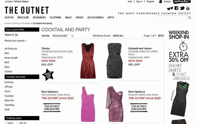
I'm looking for a cocktail dress so I filter the list again by picking "cocktail and party". It's now down to 368.


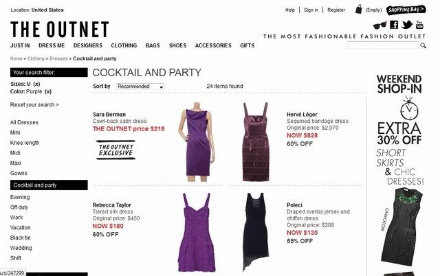
I fancy getting a purple dress so I filter again. 24 choices? That's more like it.


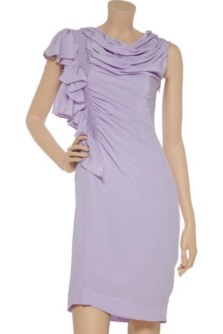
For the record, my favourite dress out of the 24 is this lilac Zac Posen number. I wish I really have a wedding to go to so I can justify buying it :-D


With three clicks I narrowed down the list to around 1% of the dresses available, which fit my requirements and are available in my size. So logical, right? Surprisingly many etailers get it wrong.

To me, the most important filter is size. It is so frustrating to find an item that I like, only to discover that it is not available in my size. Repeat this scenario multiple times and I'll leave your e-store and go elsewhere.

Category, occasion, colour and brand are also useful filters that should really be compulsory for all e-stores.

One filter in my e-store wish list is by fabric. I'm not a big fan of clothes made with polyester, so I'd like the ability to exclude them from my search. I've yet to come across an e-store that offers this option.

So listen up Myer, DJs (its online store is pretty awful), Witchery, Country Road and co, lift your game or you'd find prospective shoppers clicking away from your e-store to a better equipped competitor.

How often do you use the filter function, and which category is your favourite?

12 January 2012

Etailers Don't: Too many pages

One of the ideas I came up with during the planning of The Etail Queen is to talk about good and bad features on online stores. This is the first of the Etailers Don'ts series, and there will be a series on Etailers Do's as well.

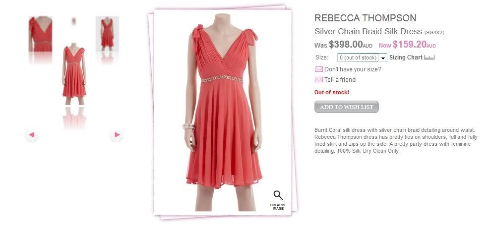
I mentioned in the first post that the #1 Etailers Don't is displaying items that are sold out, e.g.


Unfortunately there are other bad website designs.

You would've thought that etailers will do anything to minimise the distance between prospective customers and the item(s) of their desire. In the online world, clicks equal distance. The more clicks required, the more likely for the shopper to browse elsewhere.

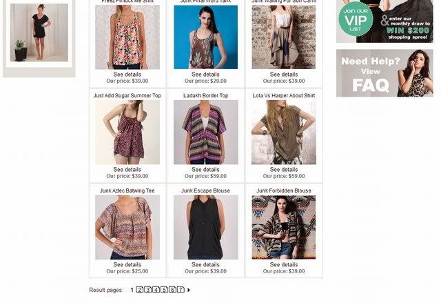
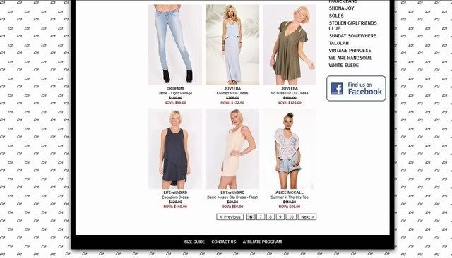
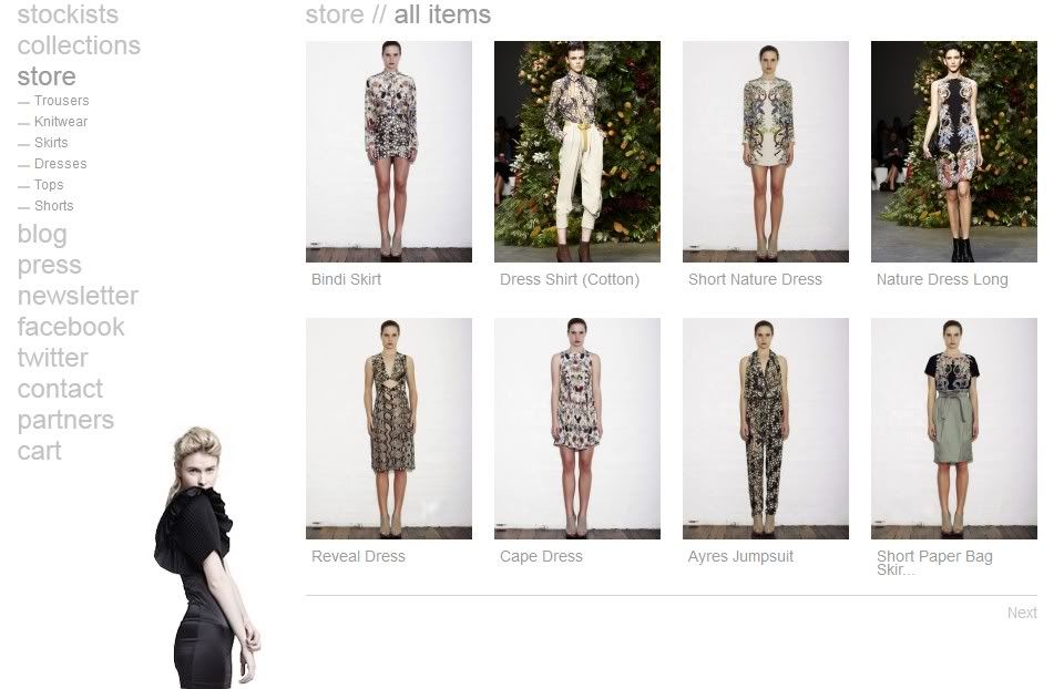
That's why I don't understand why some etailers make us click, click and click again just to see their products. For instance, I have to click 6 times to see the following collection.

Unless you're ASOS or similar brands with thousands of items, 7 pages plus scrolling up and down is too much of a hassle. I would have given up.

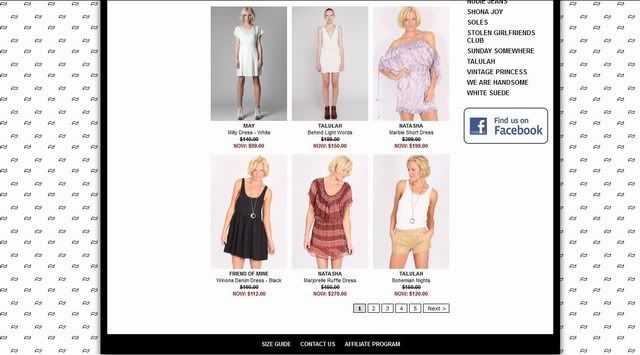
And I found a worse example.

Not only is the number of items per page restricted:


But there are actually more than 5 pages of items to go through:


There may be more. Even for the purpose of research I couldn't be bothered finding out if there is a page 11.

This is the equivalent of walking into a store with multiple levels and each level only displaying 15 products. Do I really want to walk up all those stairs?

You may think that people like me are just lazy. But you know what? Etailers have to cater for their target audience, and if they have short attention span and don't like clicking a lot? You have to factor that into your website design.

Many online stores allow you to change the number of items on display each page. That caters for people like me who wants to see everything on the same page, as well as people who have slow internet connection speed so they may not want to load everything at once.

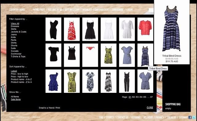
Country Road's e-store has another approach to item display - there are only 18 items on display per page, but you can see all of them without scrolling down. Hovering your mouse over an item magnifies the image.


I wish there is a horizontal scroll bar similar to the one on Shopstyle so you can move between pages easily but that is more of a nitpick.

Is this an Etailers Don't in your book? What drives you bananas when you're shopping online?